Tuesday, 1 April 2014

Weave Project

Weave is a project that I was really looking forward to because it was a completely new technique to me.  We started off with a colour study by trying to replicate some complicated images from magazines using only red, yellow, blue and white paint.  The real aim of this first task was to perfect colour mixing to achieve the right tones and shades.  Every time I mixed a colour, I painted a stripe of that colour.  When this was completed and I had all of my colours together it gave me a really good idea of how the colours work together.  This task later came in useful when thinking about colours and weaving.


To weave I used a 4-shaft table loom.  As a group we first began by learning to weave using 12 different techniques.  This gave me an idea of how everything worked and a feel for each of the techniques.  I cut off the practice weave and was then set the task of weaving a metre of experimental weave.  I had to choose a colour palette from one of my colour studies which I then used for this metre of experimental weave.


My final outcome of this project was 5 ‘concept pieces’ where parts of my weave would be sewn into a shirt.  To get to these 5 pieces, I designed 16 different concepts of how I could use weave in the design of the shirt.  Of the 16 designs, I chose 5 that I thought would work best with the width of my weave.

I decided to stick to the same colours as I had used in my experimental weave as I thought they worked really well together.  With my colours chosen I began to weave for the 5 concept pieces.  I wove 2 metres in total to use.


To make up the concept pieces I also needed another fabric.  I chose blue denim with gold in as it was a heavy fabric that would work with my weave and chosen colour palette.

The next part of the process was for me to cut the pieces that I needed out of my weave.  To do this I needed to pin my pattern pieces onto the weave and sew around the pieces.  This stopped the weave from fraying apart when I came to cut them out.  Some of the woven sections of my shirt included a button stand, cuff, yoke and various panels.  I cut my weave in different ways so that it could be used both horizontally and vertically and I also cut a piece on the bias.


After all of my pieces were finally sewn together I chose to embellish them with beads and buttons.

We also needed to have an illustration board as part of our final outcome.  My board had a Chanel bedroom background which I placed my illustrations of my completed shirt on.


I really enjoyed this project and learning the process of weaving.  Initially working with the woven fabric was challenging but I got used to it in the end.  I was really happy with the outcomes of this project.

Sam


Monday, 31 March 2014

Fashion Illustration Research

So I’ve recently handed in my critical research report to uni for marking. For those of you who don’t know already, my aim was to see what impact modern computer aided design has had on fashion illustration. Through the course of my research for the essay I looked at a lot of different illustrators and illustrations from past and present, like the one from Vogue that you see below.


To really answer my question within the word limit of the essay I had to select just a few illustrators to concentrate on. The ones that I picked demonstrated various amounts of computer aided design in their work, from David Downton who uses very little, to Bree Leman who uses software almost exclusively in the creation of her designs. Of course there are illustrators who use a mixture of mediums to get the results they want and so illustrators like Cecilia Carlstedt featured in my final essay too.


Cecilia Carlstedt

During my research I was really lucky and found some excellent interviews online with professional illustrators. This gave me a great opportunity to get some of their opinions on different mediums including computer software.


David Downton

One of my biggest fears about doing a degree course was the writing side of it because I’m very out of practice. This essay was my first in about two years and was very daunting for me initially. I found it hard to choose a subject as we had the freedom to choose whatever we liked. Once I had the idea of fashion illustration, something that I’m interested in, and began doing research it became a lot easier to focus on. Now that it’s all done and handed in I feel a lot happier with it and so now I’m just waiting for my grade and feedback.


Sam

Wednesday, 11 December 2013

Print Project - Continued

Following from my last post, my screen has now been exposed with my design.  I have spent some time preparing the screen to print, firstly by taping up the sides of the screen and then by blotting out any unwanted holes in the screen that had appeared during exposure.


The colour palette that I have chosen is blue and pink, so I began mixing colours so that I could have light, mid and a dark tones of my colours to experiment with.  I’ve added the mixed dye to my own storage pots so that I can continue to use the same tones in future.  Whilst mixing my colours I used some different binders to see how they would affect the dyes, mainly in how transparent they would make them.


In the photo above you can see my newly exposed screen with two of my mixed dyes ready to print.  Below you can see a photograph of some of my experimental test pieces from today.  The processes that you can see in these samples include both heat press printing and screen printing, in some cases both techniques have been used on one sample.


I enjoyed using both the heat press and screen printing techniques together today, I think the two combined gave some really interesting effects.  I think that as I add new shades to my colours, I will be looking for tones that are brighter and more striking.  The pastel colours I made today did give a nice effect and I think they could perhaps work well as part of a design that uses brighter colour too.  

Tuesday, 3 December 2013

Revived Tradition – Print Project

So I’m just starting out on a new print project.  I’m working around a concept called Revived Tradition; it’s a trend that I am going to use throughout the whole project.  From my initial mark making I could see a link into this particular trend.  The concept revolves around traditional patterns such as plaids, tartans, argyle and checks which I will use to come up with my own print design. I can then use this print design to experiment in different ways.


I hope to change the texture, materials and colours of the print to create different effects.  I plan to change colour variations by using different pigments, dyes and binders. I can use my print design in different ways by using techniques such as silk-screen printing and heat pressing.
I started the project by mark making.  It’s easy to do, making marks with various materials and objects like old cotton reels, floppy disks and scrap metal.  I started just using the colour black to experiment with the marks that I could produce with the different materials.  I moved later on to use various colours and shades to develop ideas further.


Soon I should have the final design for my screen. I also hope to begin experimenting with the colours and fabrics.  I've chosen pink and blue as my colours, but it's going to take some research to see what fabric will work best for me.
Sam

Luminous Light – Knitwear Project – Final

As part of the final project I had to complete 20 fashion flats, a potential customer profile, 2 fashion illustrations and a technical file demonstrating the techniques I’d learnt.  This work was in addition to the knit samples and sketchbook.
I chose 2 designs from my fashion flats and turned them into fashion illustrations.  The 20 flats showed details of garment shapes and included swatches of fabrics and yarns as well as images of the specific knit sample that would be used on the final garment.
Creating a customer profile meant that I had to think about the type of person that I wanted to market my clothes towards.  I took into consideration things like age, income and examples of possible retailers where I could see my designs eventually being stocked and sold.


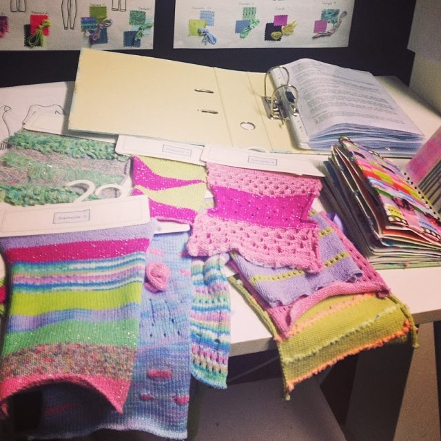
In the photo above, you can see two concept boards in the top right.  I produced these early on once I chose my colour palette for the project and referred back to them throughout.  The photo shows my base-space shortly before the final presentation to my group and tutor.  You can see my knit samples hanging below the desk, the photo below shows them up on the desk during evaluation.


Sam 

Monday, 2 December 2013

Luminous Light – Knitwear Project - Progress Update

I've been really busy learning how to use the knitting machines to achieve exactly what I want from my samples.  I've been putting in the hours both in University and at home, working on my designs.  At home, I was working on my sketchbook, looking at my images from the campus and creating concepts for how I might be able to translate these into my samples.  

Over time I developed my sketch book with ideas and transformed these into 15 final samples to be submitted.  I worked to construct and create the samples in the studio using knitting machines and new techniques.


Some of the techniques I learnt and tried to implement in my samples included Picot/Holes, Weaving in E-Wrap, Knots, Tassles and Hooking Up (I mentioned Hooking Up in my last post). Below you can see a photograph of some more of my samples.  In this you'll see a number of the techniques that I've just mentioned.  You can see Picot/Holes in the bottom right, Hooking Up in the top right and Knots and Weaving in E-Wrap featured in the top left.


I've really enjoyed learning to use the knitting machines in the studio and it's definitely given me something to think about for future projects! - it's even inspired me to take up hand knitting and crochet at home!  You can see one of the samples in progress below, this one's an example of knots before they were tied.


Sam

Luminous Light – Knitwear Project - First Post

Design Brief

For my first project at University I had to create 10-15 knit samples inspired by aspects of the campus' architecture and structures.  Focusing on these areas, I went in search of unusual or interesting features, specifically looking for textures that it might have been possible to replicate using knit.  I looked at aspects such as metal work, roofing and steps, because of the clear geometric and linear nature of these areas.


The two photographs above show an example.  The image on the left shows a distinct pattern that was found on the back of a chair in the lower concourse and on the right is a photo of a knit-sample that I created in response.  In the knit-sample I have achieved the linear effect by hand manipulation on the knitting machine in a process known as 'hooking up'.

Sam